Tosaf, an Israeli major player in the world’s plastic industry has been developing color additives and servicing clients in over 50 countries. Having acquired subsidiaries with long standing position in their respective markets, these acquisitions presented a problem to the brand as they were reluctant to be incorporated into Tosaf’s existing brand. To achieve such a transformation and create a brand unity, Tosaf’s brand needed to evolve.
The Task
To create a facelift for Tosaf’s logo and a full vibrant and up to date graphic language that can be adopted by Tosaf’s subsidiaries worldwide.
The solution
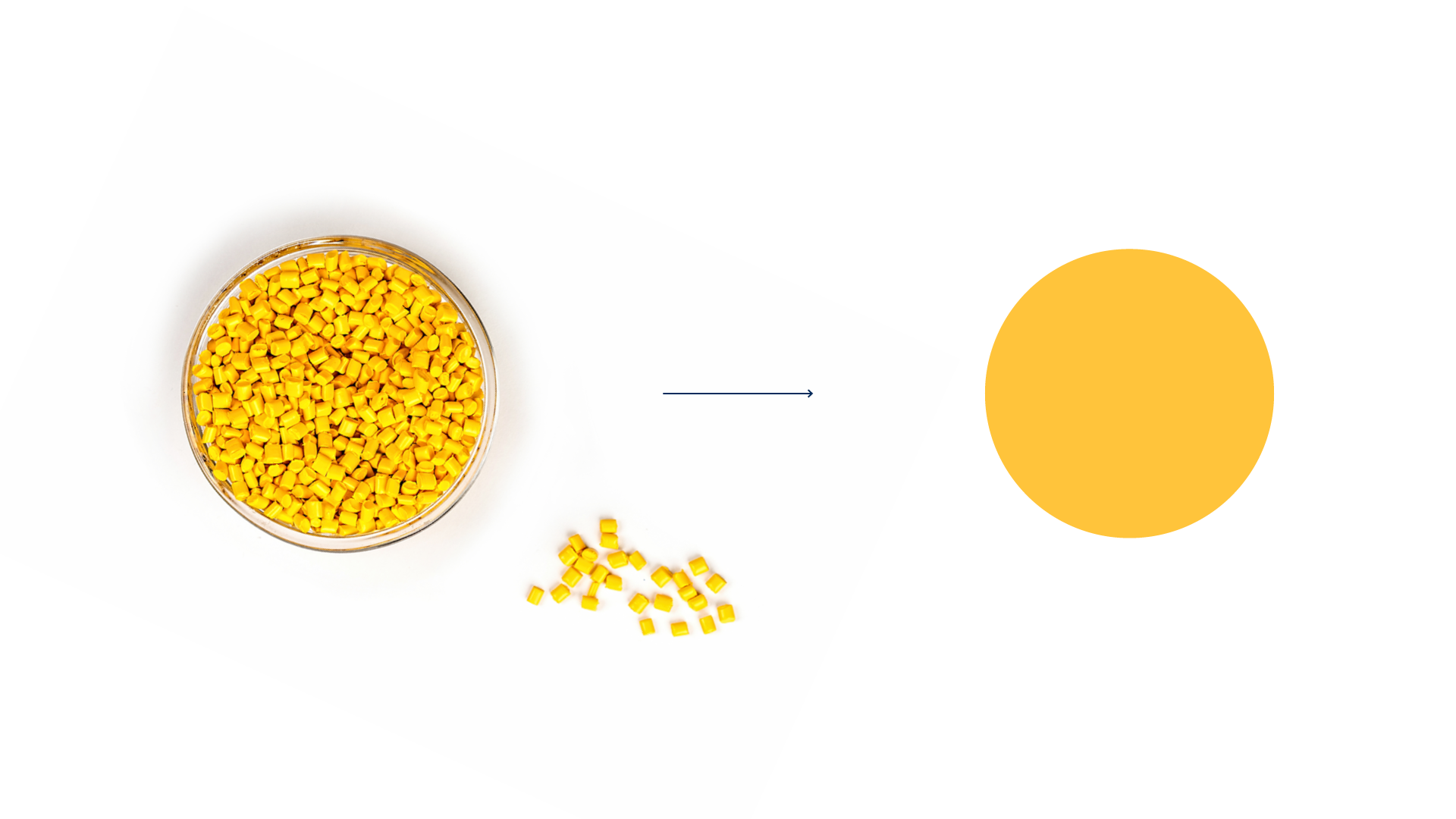
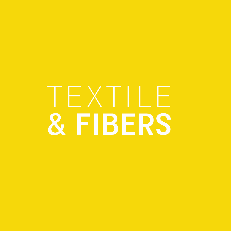
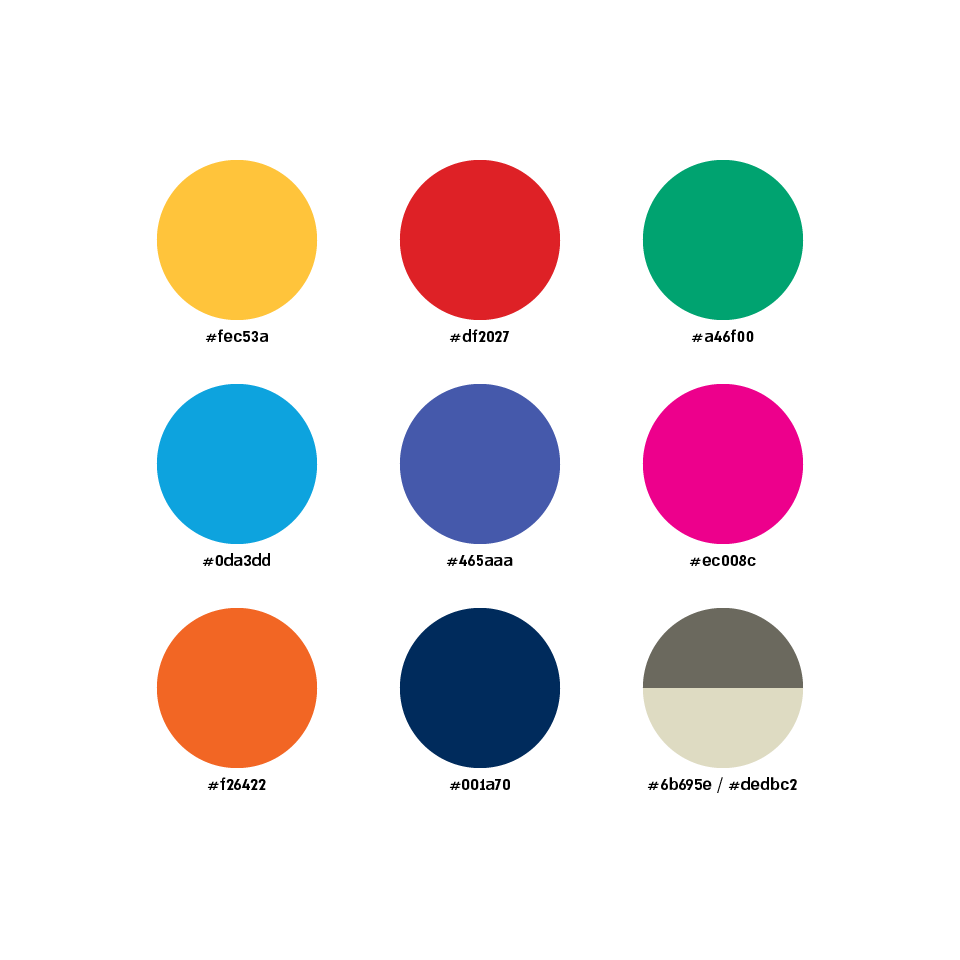
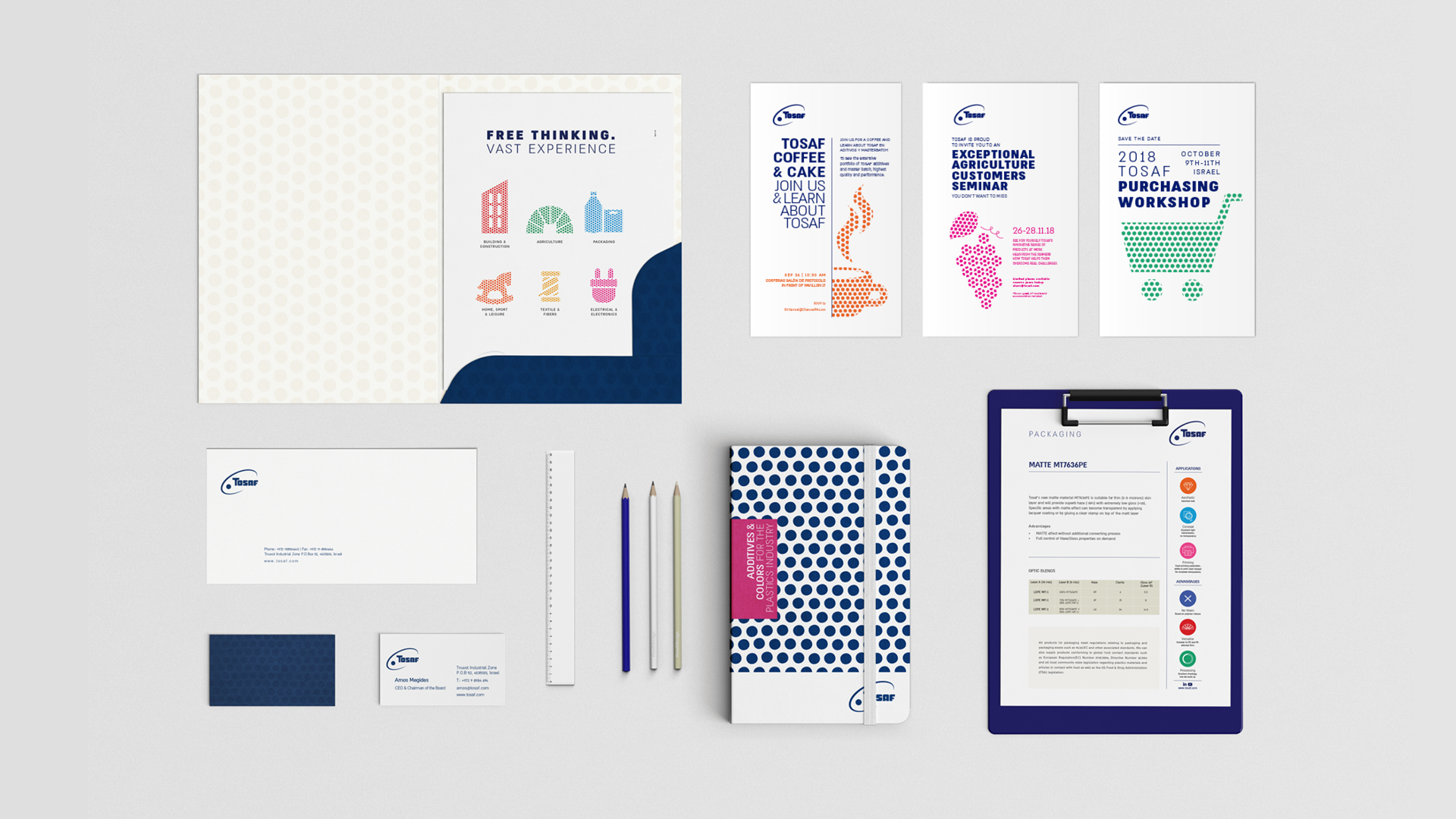
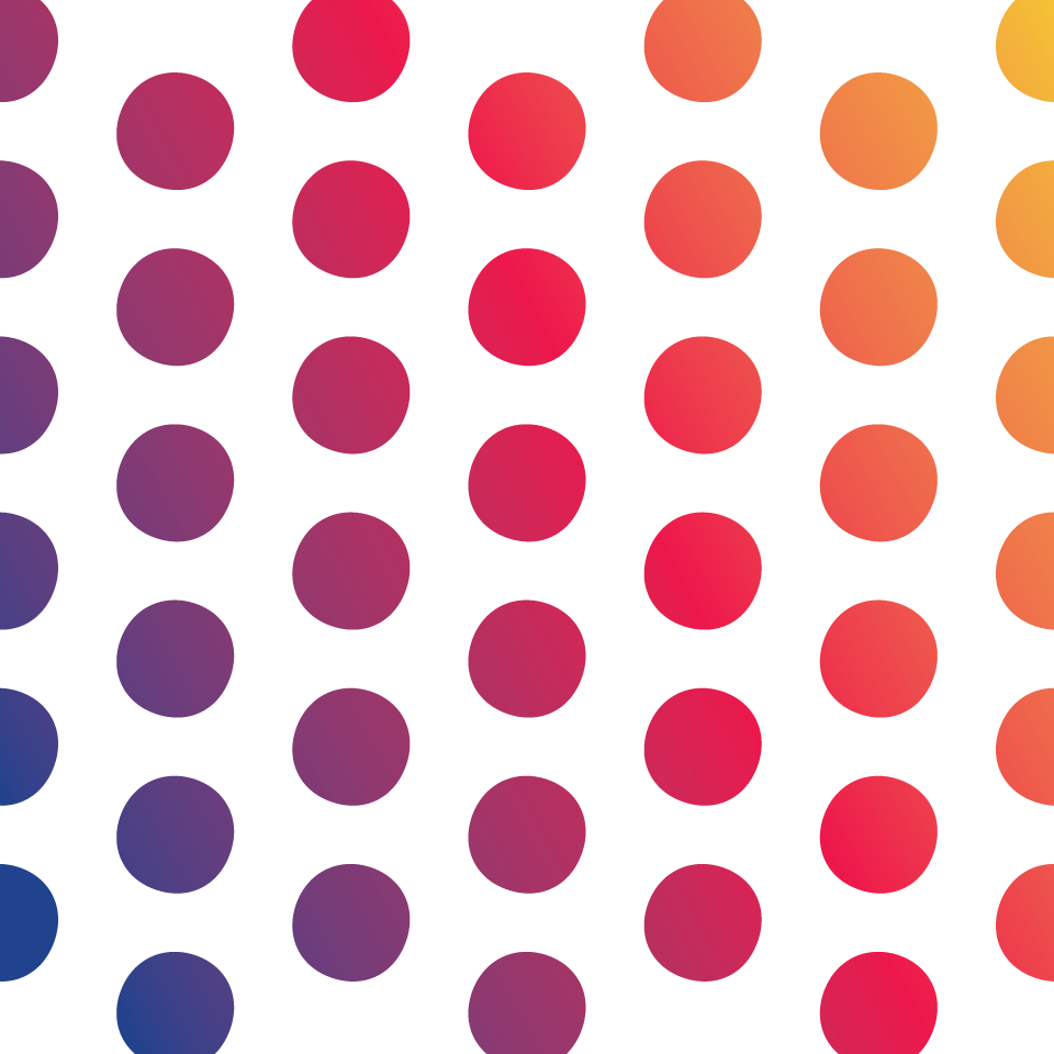
After an in depth study of the brand’s history and taking a close look at Tosaf’s headquarters labs we came up with a visual formula based on the plastic color grains that are the essence of Tosaf’s products. The module we created enabled us to create a graphic language for Tosaf’s varied divisions. Once the internal identity of each division was established we were able to accommodate all needs of the brand, from marketing materials and advertising to the brand’s physical presence at international fairs and exhibitions. The result has been selected by DesignRush for their Best Stationary Print Category