Brand evolution for Tosaf,
colour additives for plastics

50+ countries · one brand
Tosaf, a major Israeli player in the world’s plastics industry, develops colour additives for clients in more than 50 countries. Its new subsidiaries had strong names of their own, so the brand had to evolve before it could bring them together.
Refresh the logo and build a vivid graphic language the subsidiaries could adopt worldwide.
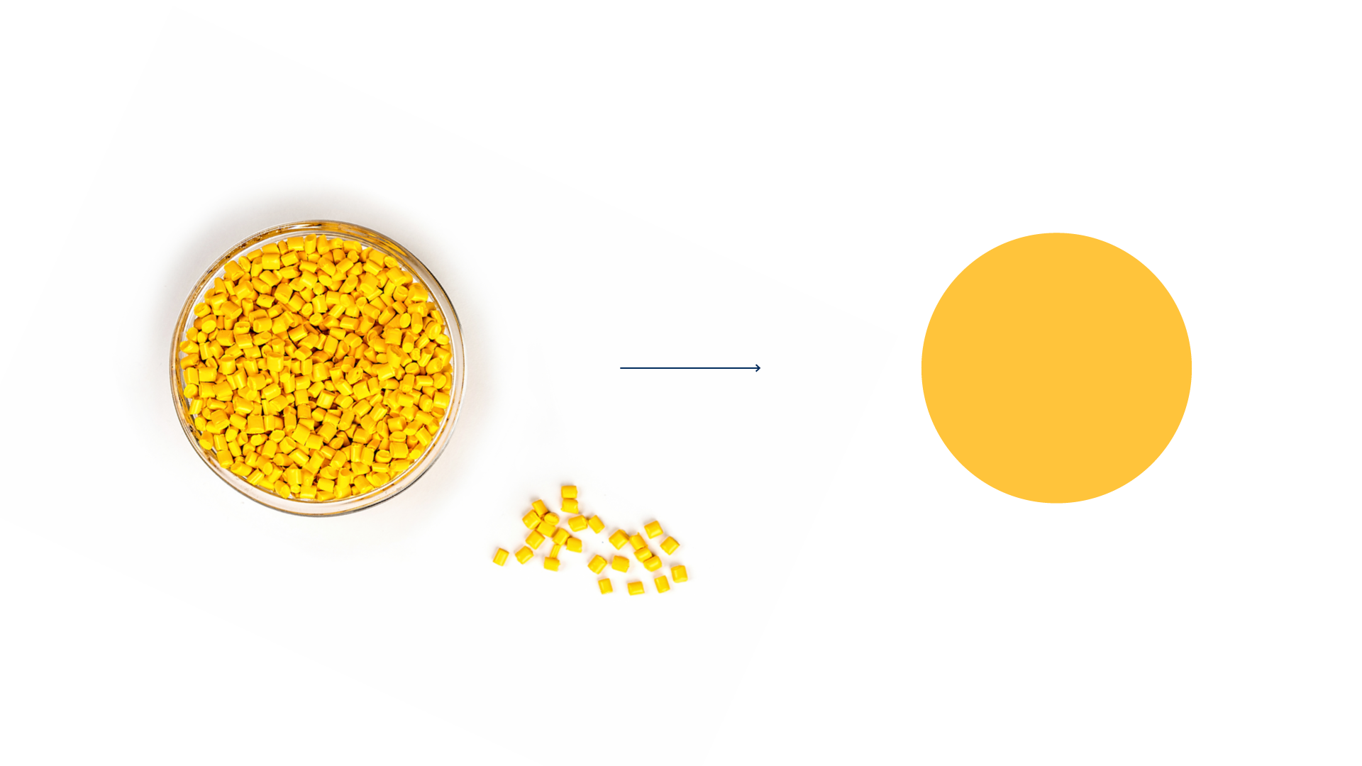
A visual module built on the colour grains at the heart of every Tosaf product.
Selected by DesignRush in its Best Stationery Print category.

The same dots draw icons for each division and market, and become patterns and gradients across every surface.



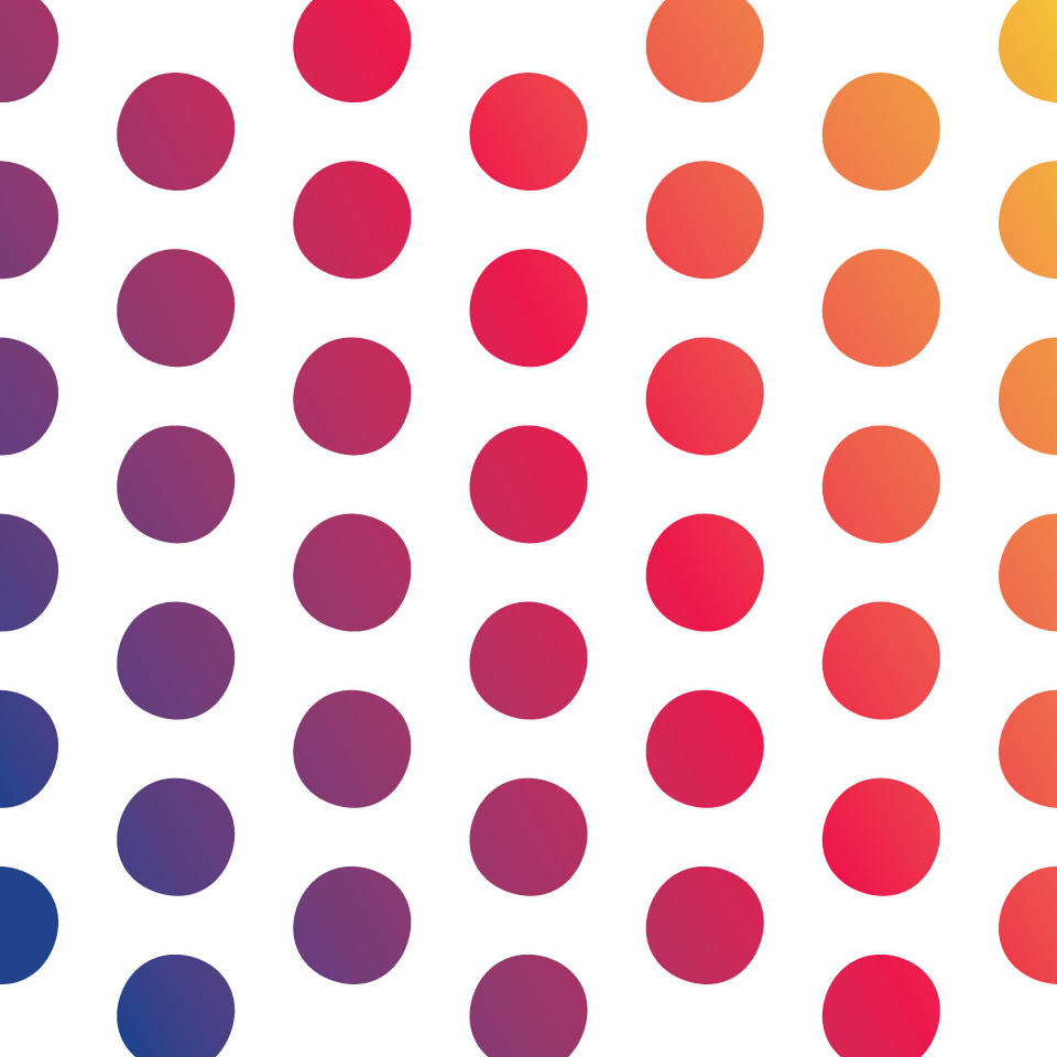

Stationery, posters, brochures and folders share the dot module, with a different colour story for each message.


Boxes, cups and calendars bring the colours of the grains off the page.


