A story,
told twice.
Brand identity and digital
for TellNY
Tel Aviv · New York
01 — Logo system
Tell NY. And Tel Aviv, NY. One word carries the voice, the origin and the destination. The mark makes that idea visible.
Primary — vertical tag
Reversed — black
01 / The quote
Two quotation marks lead the mark. TellNY’s product is the story, so the logo opens one.
02 / Two weights
A narrow, light TELL over a heavy, solid NY: Tel Aviv energy meets New York weight.
03 / The tag
A vertical sky-blue tag hangs from the top edge of every page, like a bookmark in the news.
02 — Color
Sky blue carries the brand, white lets the story breathe, and ink draws the editorial grid. Deep brown appears in one place only: the name inside the mark.
RATIO IN USE: white carries the story; sky frames it; ink draws the grid; brown lives only in the wordmark.
03 — Typography
TellNY brings Israel’s most ambitious tech companies to the American stage: New York media, investors and enterprise buyers.
04 — Visual language
QUOTE MARK
Every story opens with a voice: pull quotes, headlines and calls to action.
DIAGONAL CUT
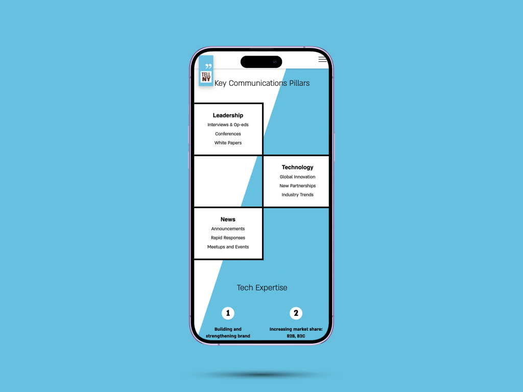
The blue-white split runs through every screen. Two cities in one frame.
THE TAG
A bookmark, not a badge. It marks where the story starts.
05 — Communication system
Every story has a home. The framework gives each client a clear route from Tel Aviv into the American conversation.
Leadership
Technology
News
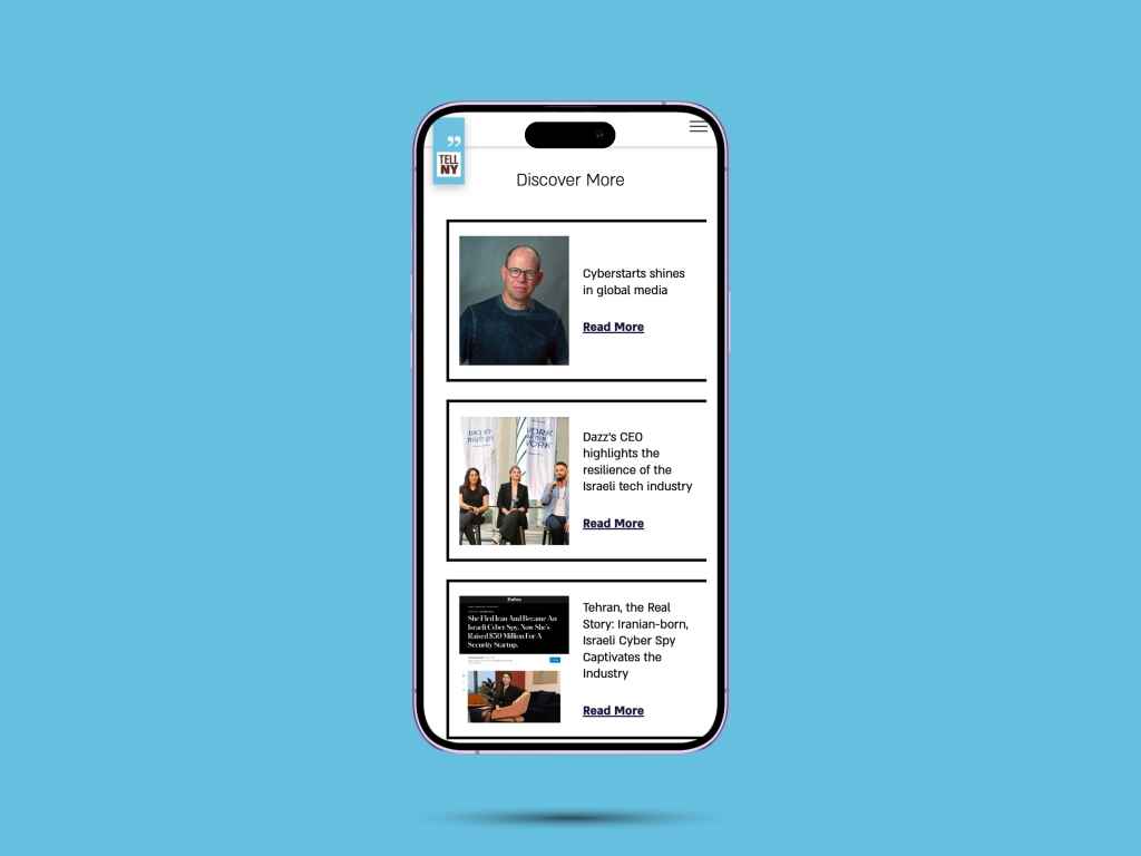
A warm, editorial and credible identity, built from scratch for the Israeli tech companies TellNY brings to American media, investors and markets.
