Point-of-care and laboratory diagnostics
Har Hotzvim, Jerusalem
 Brand · Print · Exhibition
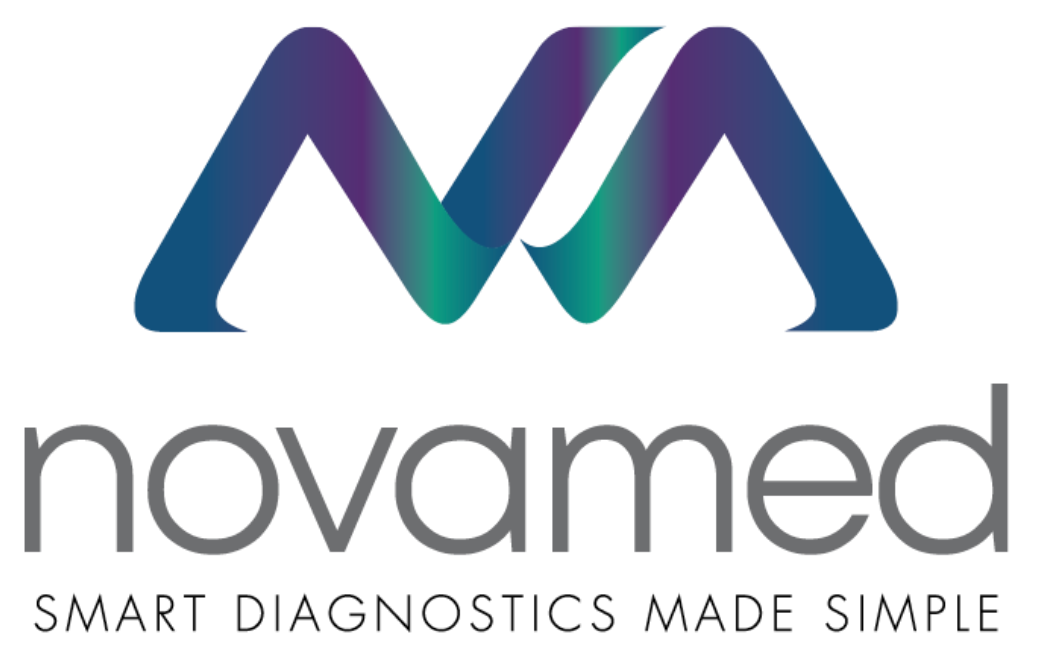 Primary — on whiteReversed — on the gradient
Two folded ribbons form the N and the A. Together they read as a peak on a monitor line. The colour moves through each fold from purple to green.
A light, lowercase “novamed” in gray. The mark carries the colour, so the name can stay quiet and clinical.
“Smart diagnostics made simple” sits under the name in spaced capitals. It is the company’s positioning and the brief for everything else.
Two brand colours with a deep blue between them. Purple stands for the science and green for the result. On white, the gradient is used in small, sharp areas, and the page stays clean like a lab.
The gradient: purple to green through a deep blue. It is used in the mark, on product sheet headers and in the corner swoosh.
אבגדהוזחטיכלמנסעפצקרשתAa Bb Cc Dd Ee Ff Gg Hh Ii Jj Kk Ll Mm Nn Oo Pp Qq Rr Ss Tt Uu Vv Ww Xx Yy Zz 0123456789 ?!
One family for both languages. Heebo has Hebrew and Latin designed together, so a Hebrew sign and an English product sheet look like the same company. A full range of weights covers everything from small print on test instructions to large text on the exhibition stand.
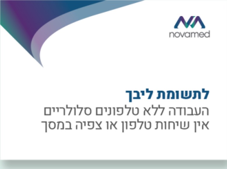
One curved corner in the gradient, taken from the fold of the mark. It marks every page and sign, and the rest stays white.
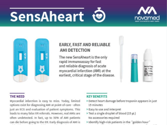
Each product sheet opens with a gradient band, the product name in white and a simple line icon.
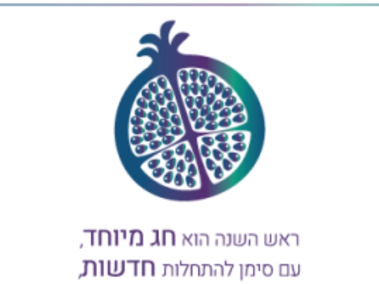
For the holidays the gradient becomes an illustration: a pomegranate for the Rosh Hashanah greeting.
Every product gets the same structure: the need, NovaMed’s answer, key benefits, ideal for, and how to use. A doctor or a distributor reads them in the same order every time, so a new product is easy to understand.
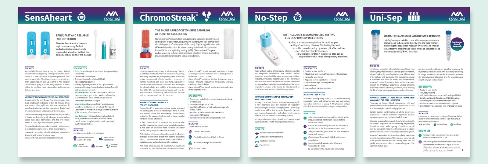
A rapid test for early detection of acute myocardial infarction at the point of care.
Urine sampling and streaking at the point of collection, for faster UTI diagnosis.
Rapid antigen testing for respiratory infections, with no buffer or mixing step.
A tube with a membrane that makes lymphocyte separation simpler and faster.
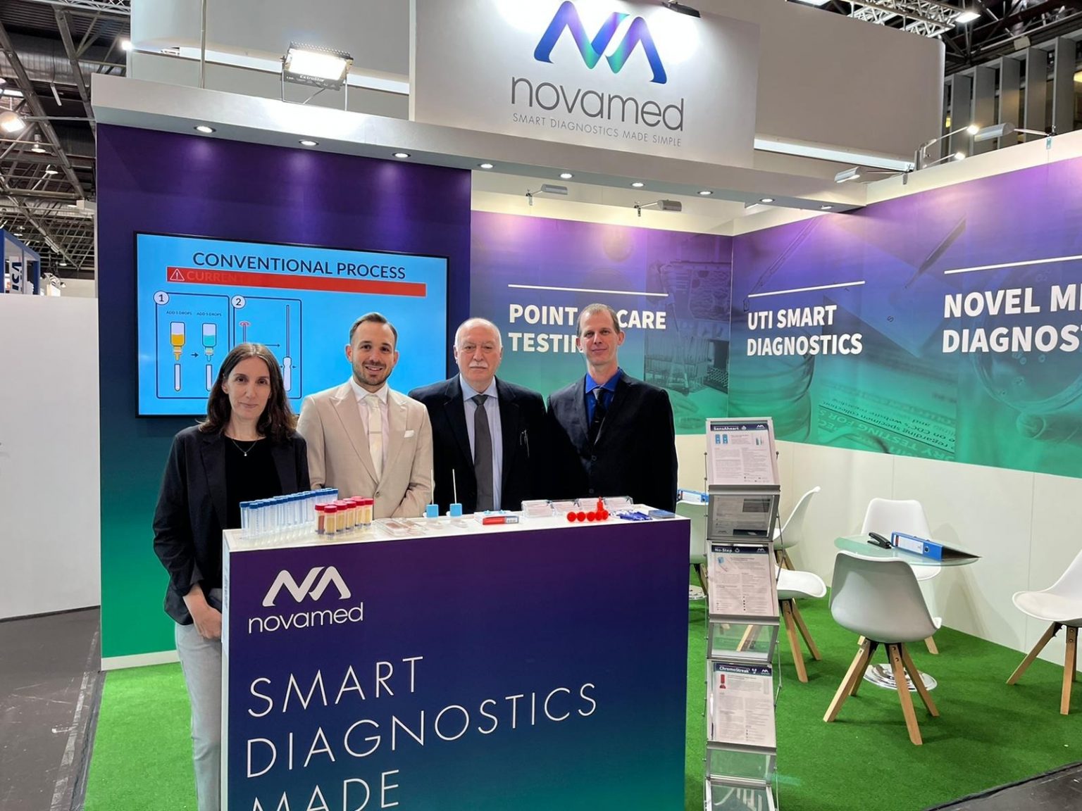
The gradient covers the walls, the logo sits above, and the counter carries the promise. The product sheets stand in the rack beside it.
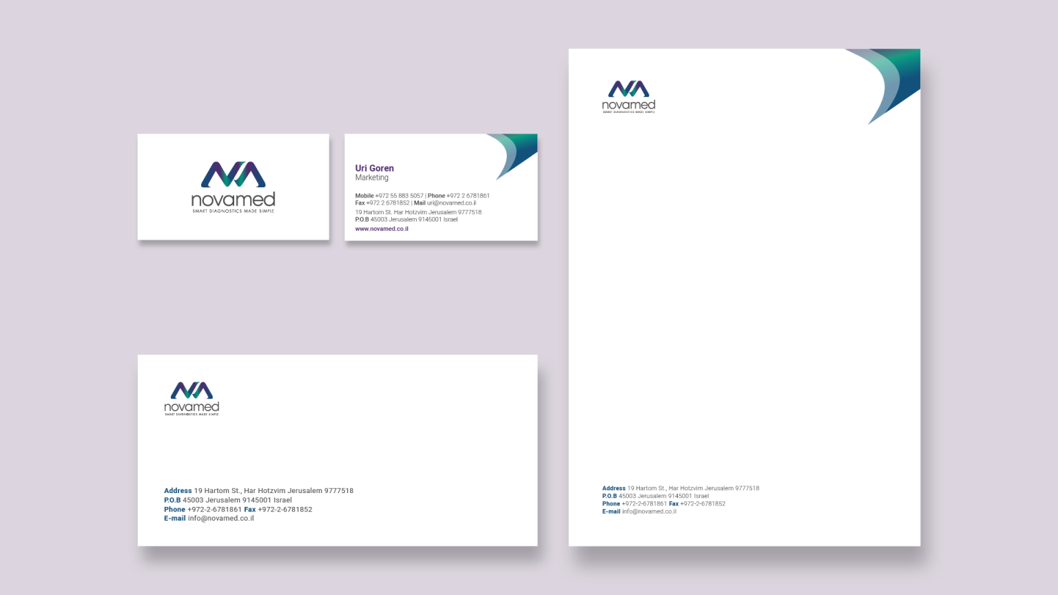
White paper, the logo in the corner and the gradient swoosh at the top. Contact details are set in the brand blue and gray.
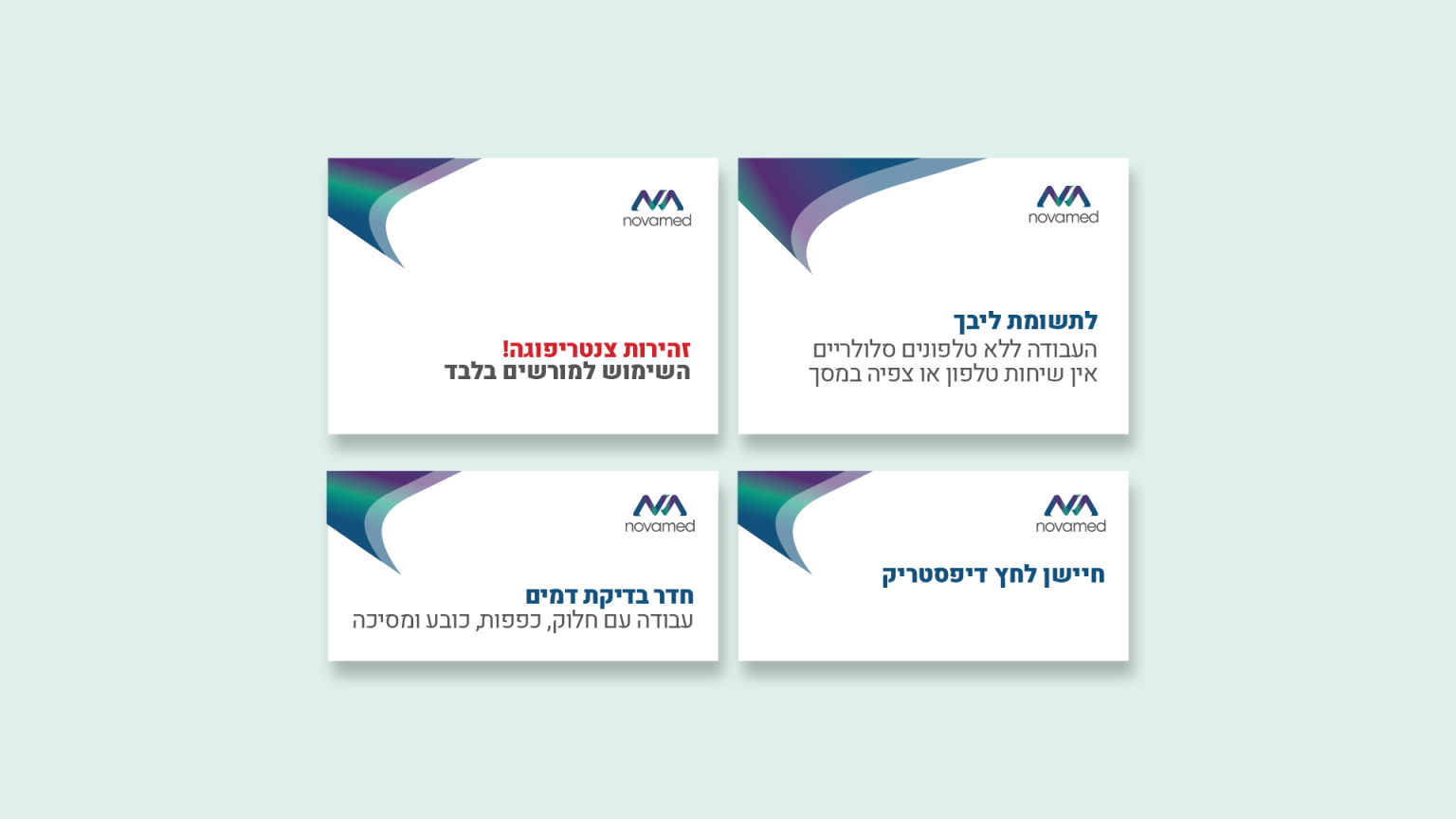
Instructions for the blood test room, the centrifuge and the reading area. A bold line says what it is and a light line says what to do. Red is used only for warnings.
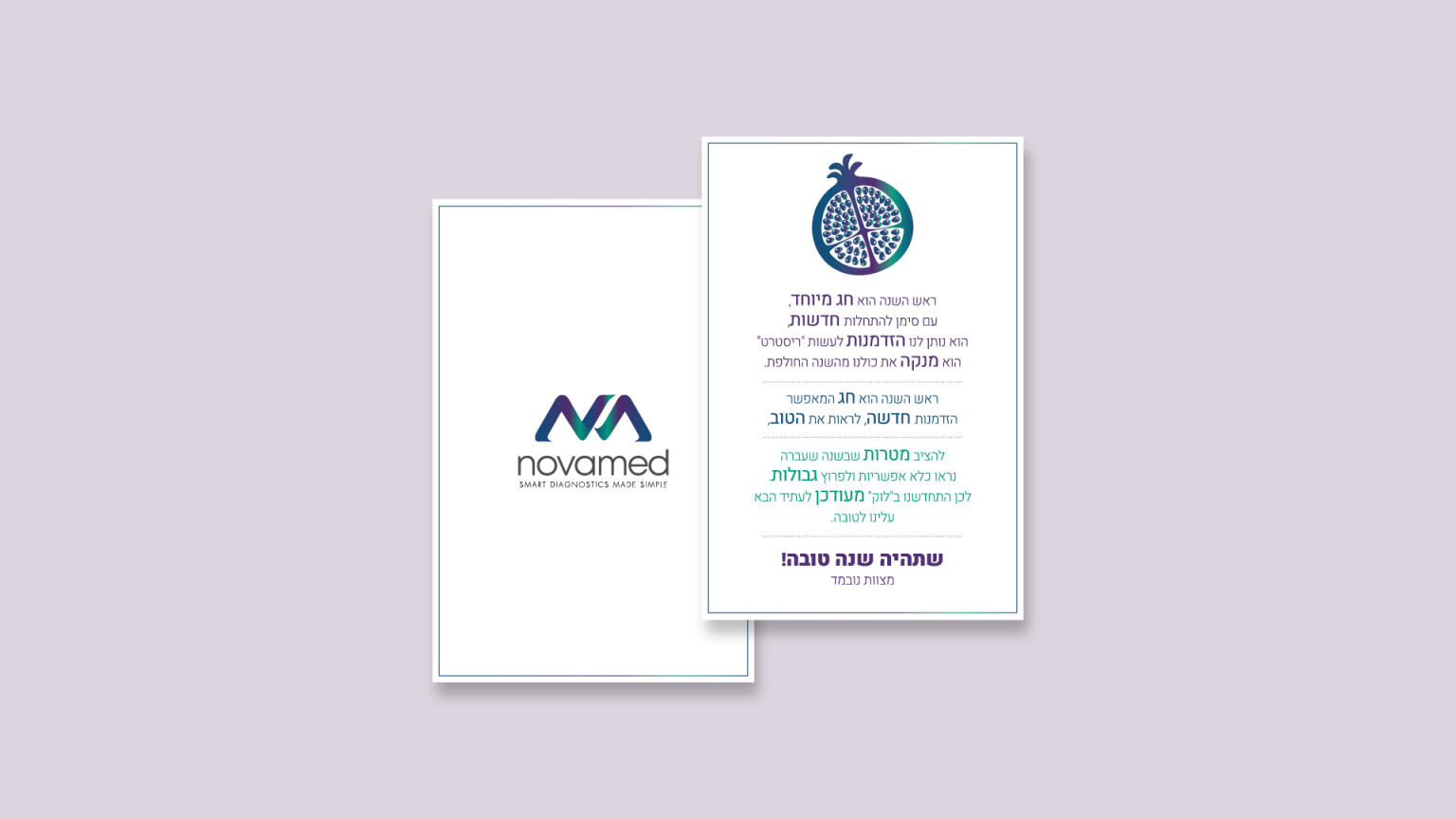
The logo on the cover and a pomegranate inside. The key words of the greeting are picked out in purple and green.
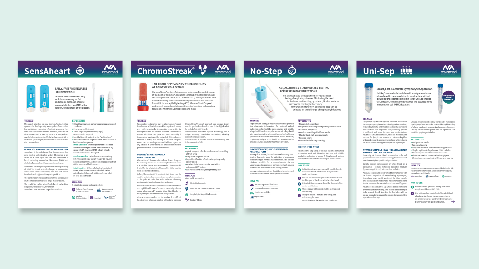
The same grid, header and icons for every test. Only the product name, image and content change.
A med-tech brand that explains itself quickly. The colour and the mark make it recognisable, and Heebo with a fixed structure keeps it clear in both languages, from a test instruction to a trade show wall.
