Brand, campaigns and digital
for Hillel – Yotzim BeShe’ela

Brand · Campaign · Social
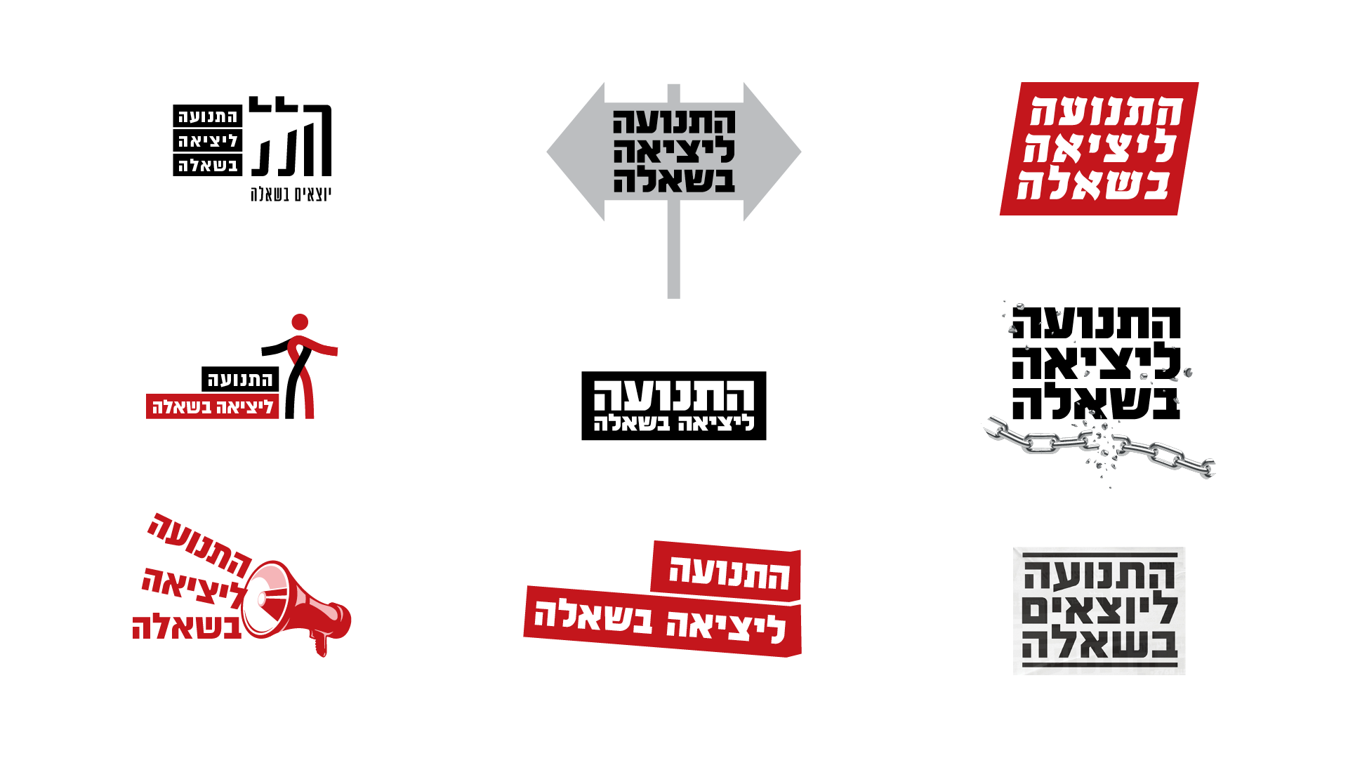
Hillel has helped people who leave ultra-Orthodox communities for 30 years. The identity gives it a bold red mark and two Hebrew typefaces: Susita for headlines, Almoni for text.


Letterhead, business cards, folders and brochures carry the red mark and the full palette into everyday print.

Ongoing work for social media: support for small businesses, online job coaching, Independence Day, Pride month and a series on great thinkers.


A booklet, a magazine and Pride T-shirts carry the same colours into print, and the website opens on a real face.

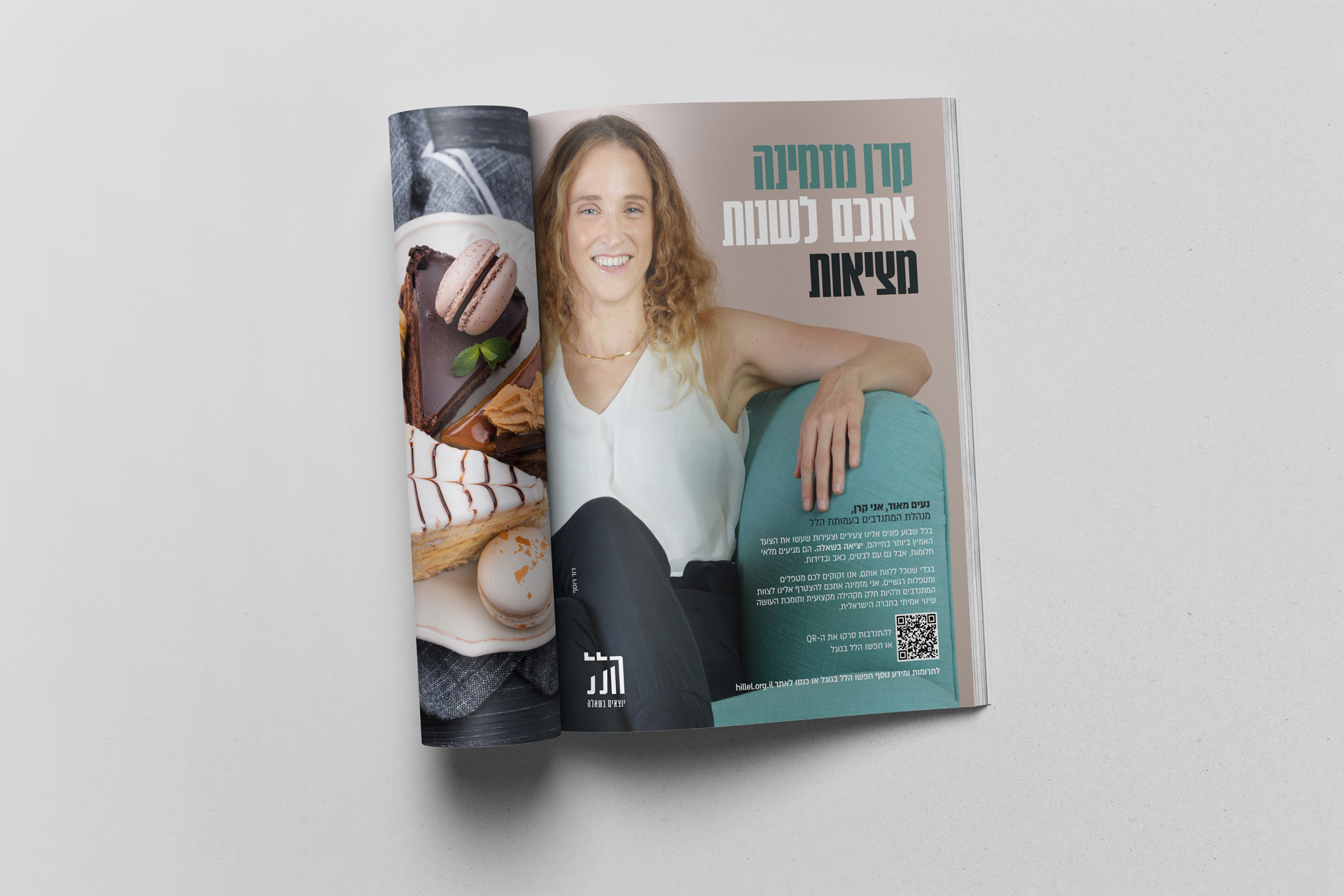


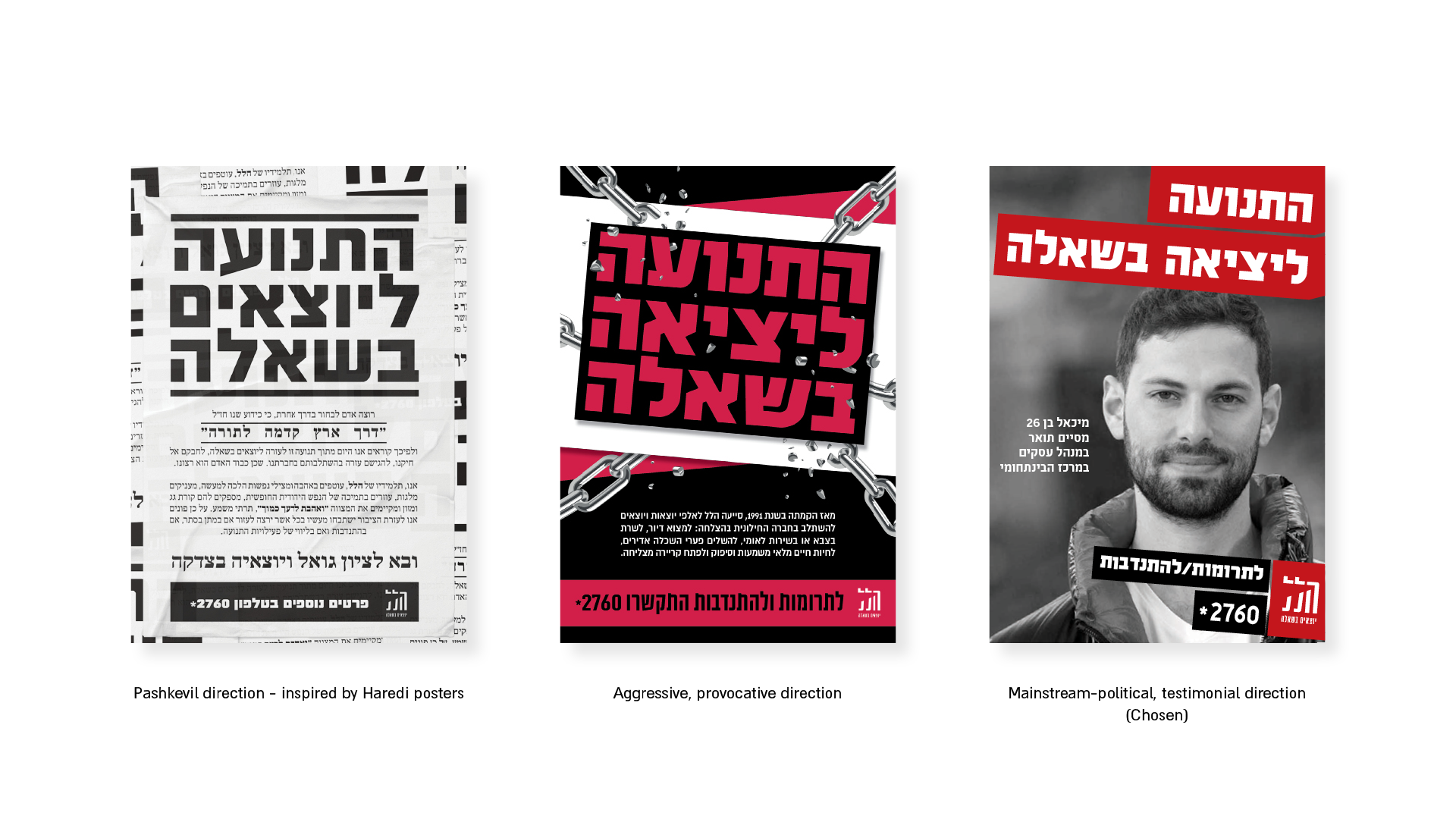
For years Hillel stayed out of sight. When it needed to be seen and to raise funds, the campaign had to be positive and never turn against the communities people leave.
Bring Hillel to public attention without advocating leaving or provoking anger.
People proud of their journey, in the look and feel of a political campaign.
Public awareness for Hillel, and a community proud to be seen.


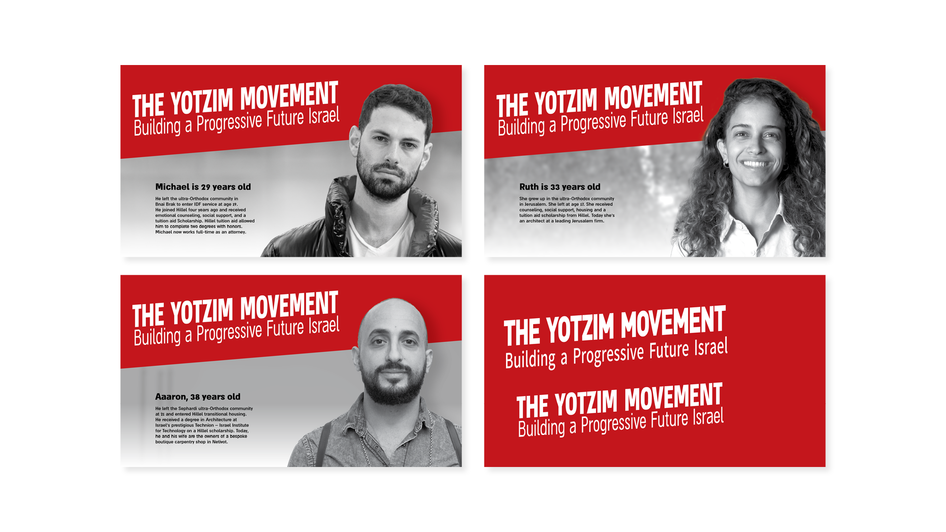

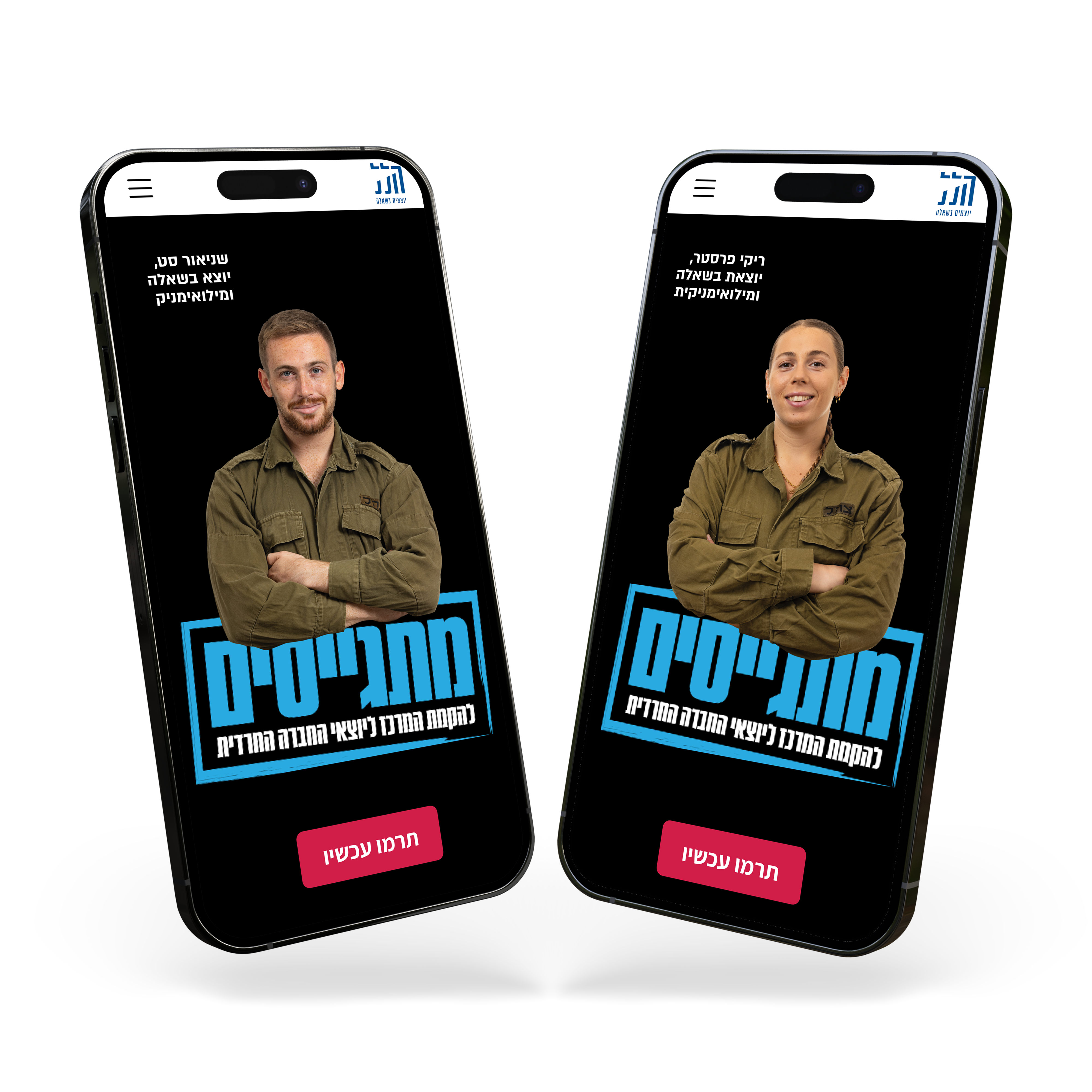
Mobile ads for the campaign to build a new centre for people leaving the ultra-Orthodox world, led by the people Hillel supports.