The Tel Aviv International
Documentary Film Festival
 Brand · Key art · Print · 2018–2025Primary — on yellow
 Reversed — on black
The heavy letters are built from halftone dots, like a photo printed in a newspaper. Documentary, made of real grain.
Thin, lowercase and widely spaced. The city sits quietly beside the subject.
Top-left on every poster, in every city and every edition. Partners line up to its right.
Yellow carries the brand and black does the talking. No gradients and no photography on the key art. The two colours are strong enough to own a street wall from across the road.
Ratio in use, measured across the 18 main posters — yellow dominates, black speaks, white lights.
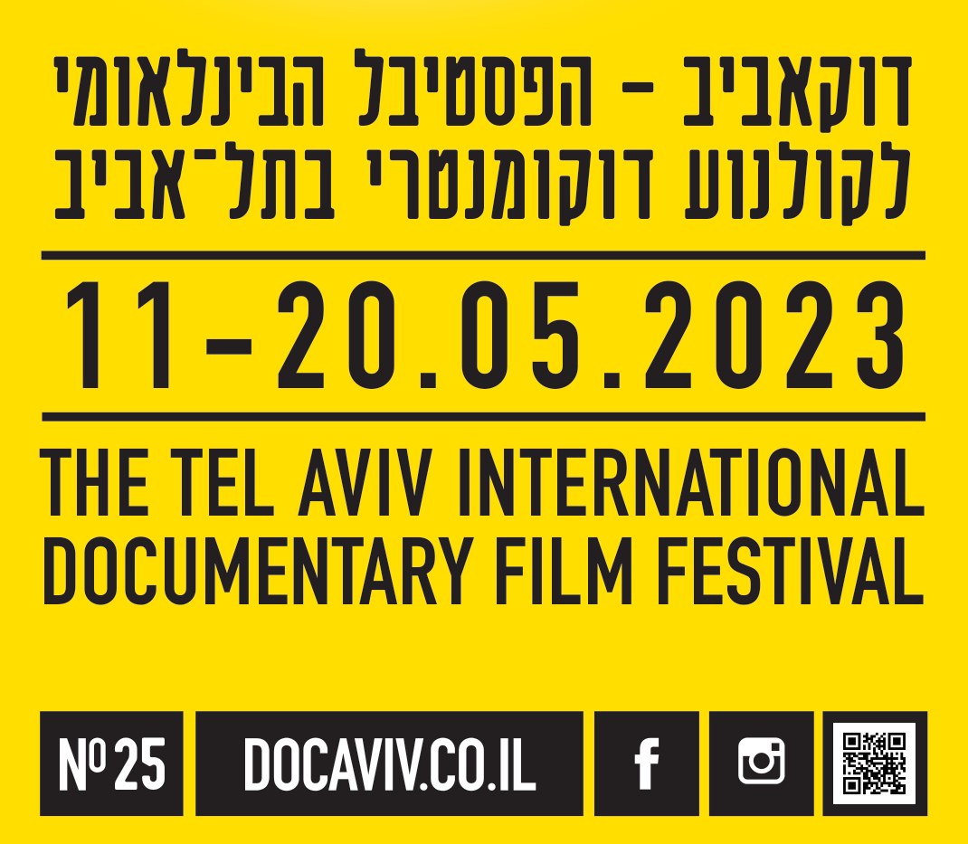
The type block sits under the image in the same order every year: the name in Hebrew, the dates, the name in English, then the edition tabs. On the Galilee posters Arabic joins the Hebrew. Only the image above it changes.
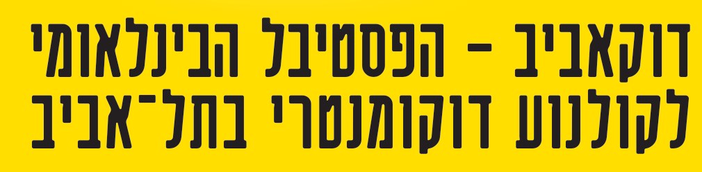 Hebrew title37 Regular
 DatesDIN Condensed Bold · tabular, wide tracking
 English nameDIN Condensed Bold · uppercase
 Edition tabsDIN Condensed Bold + 37 · reversed out of black
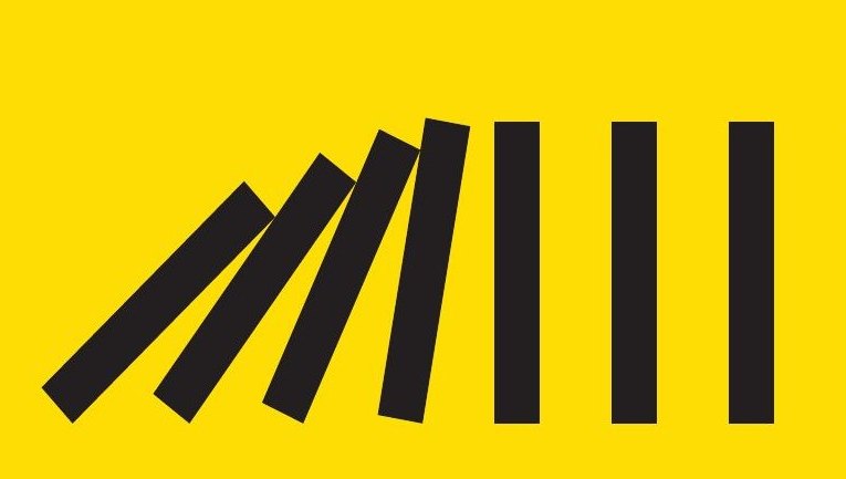
One idea per edition, drawn flat in black. No collage, no film stills, readable in a second.
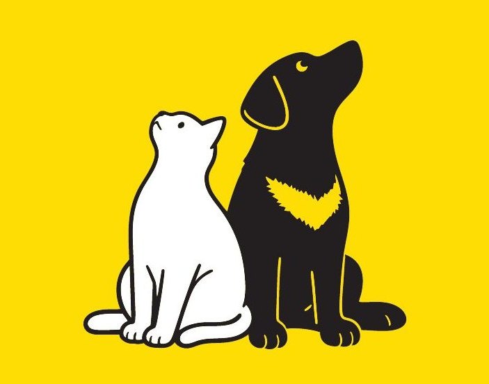
White is used sparingly: for light, for highlights and for the second character.
Black tabs reversed out like a ticket stub carry the edition number, the site, and in 2020 an ONLINE tag in the date line.
Elections, a pandemic, protest, war, evacuation and the road home. The posters never illustrated the news, but each one answered a simple question: what does this year feel like?
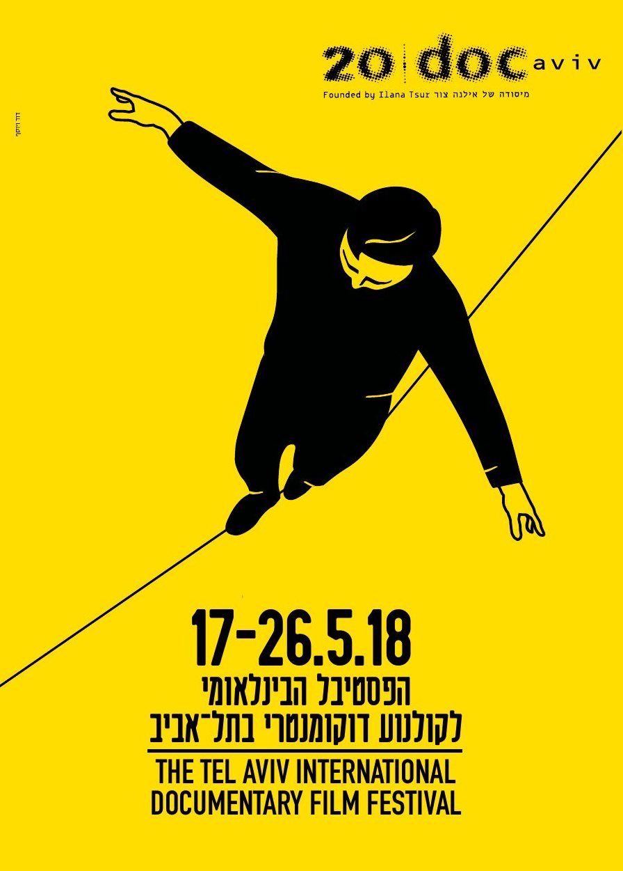
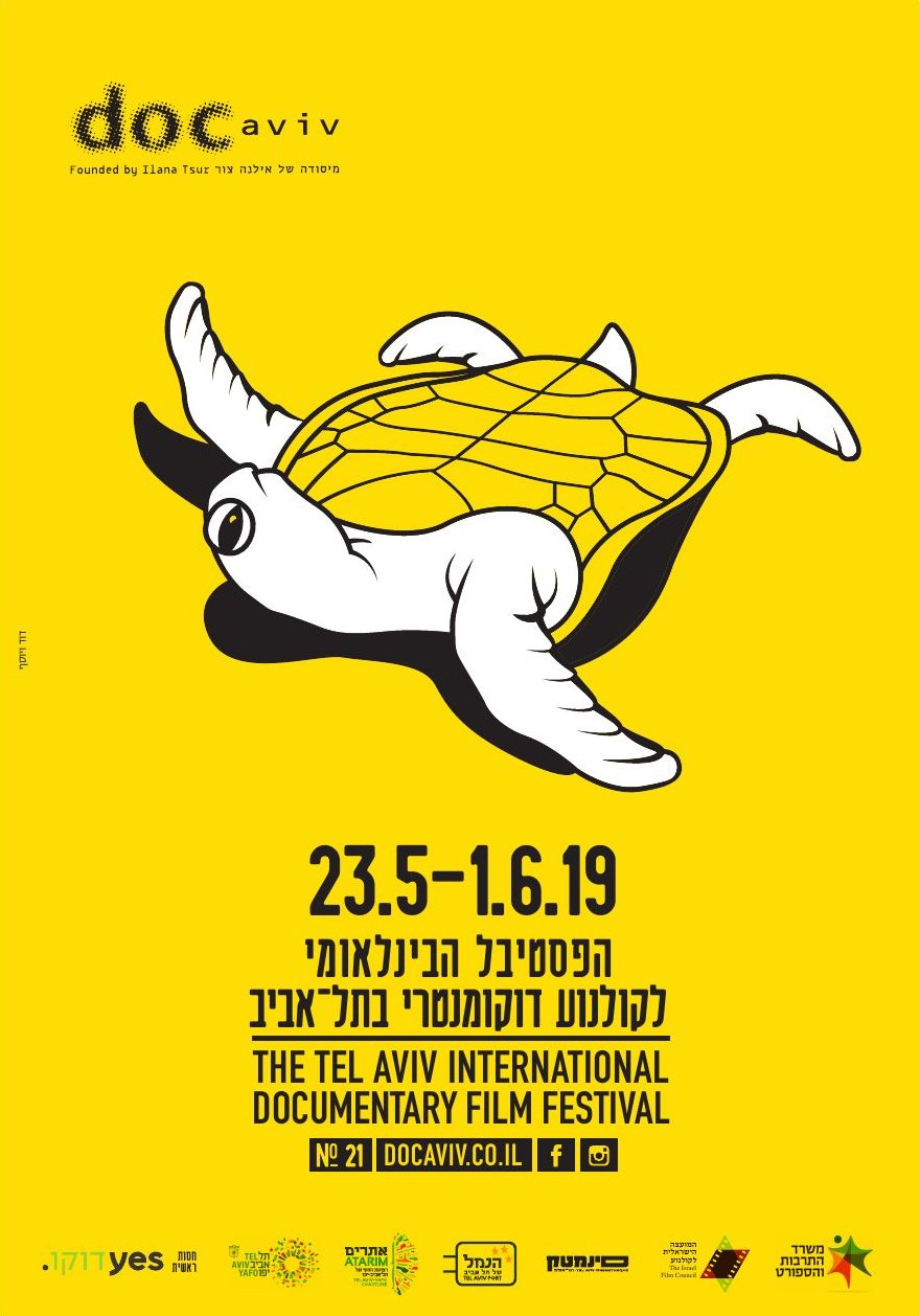
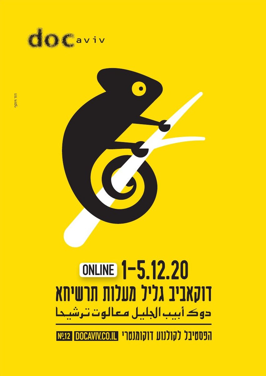
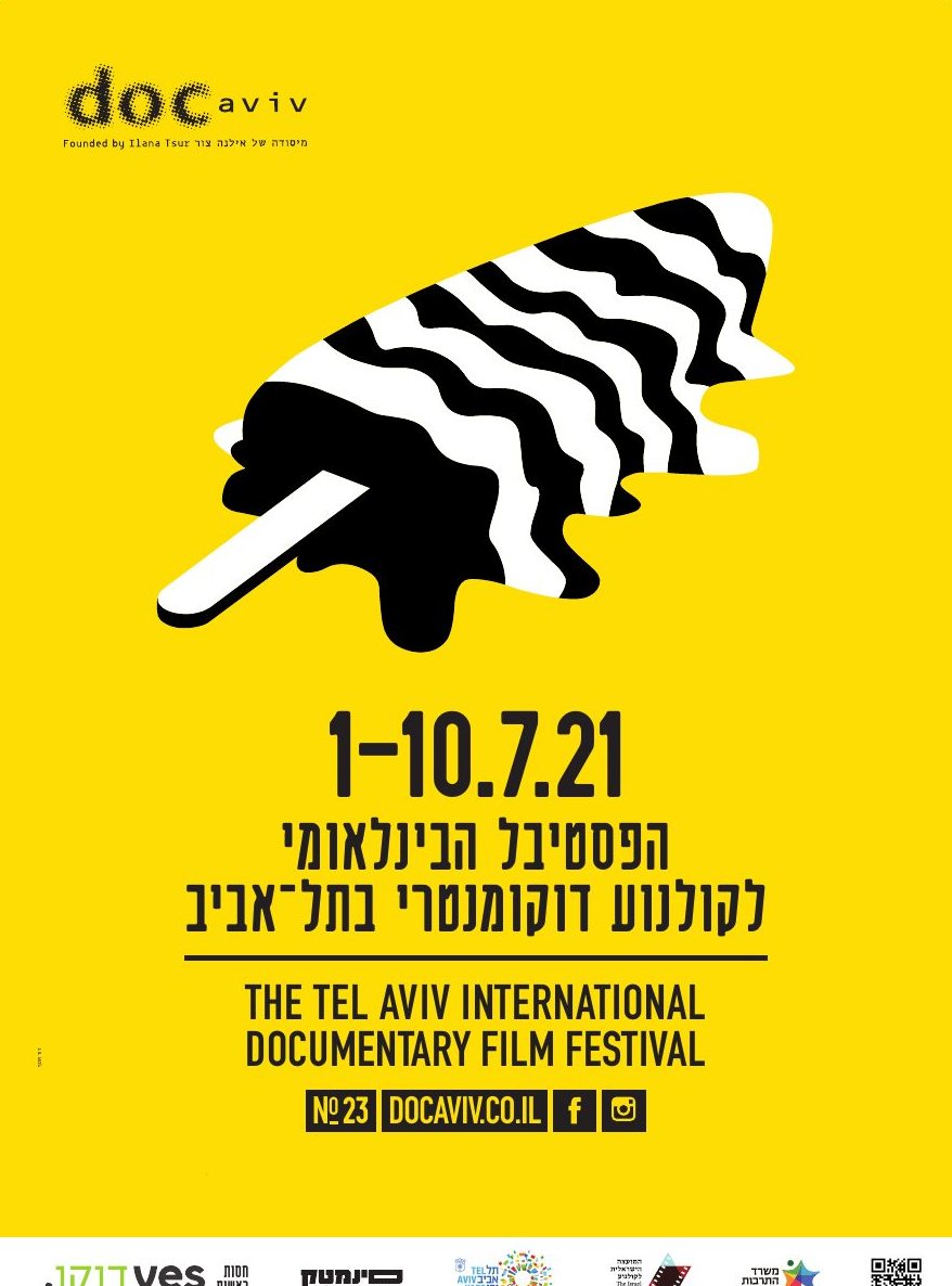
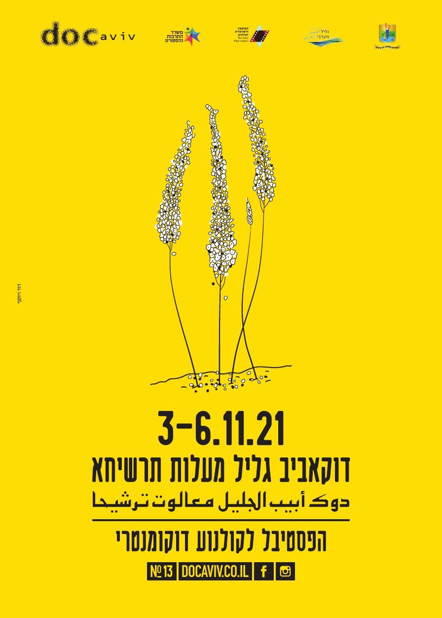
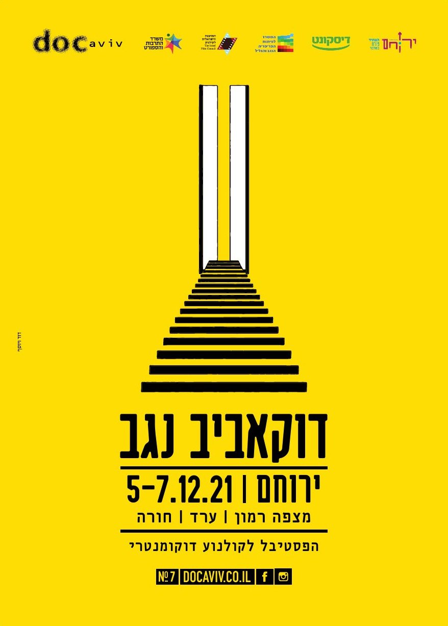
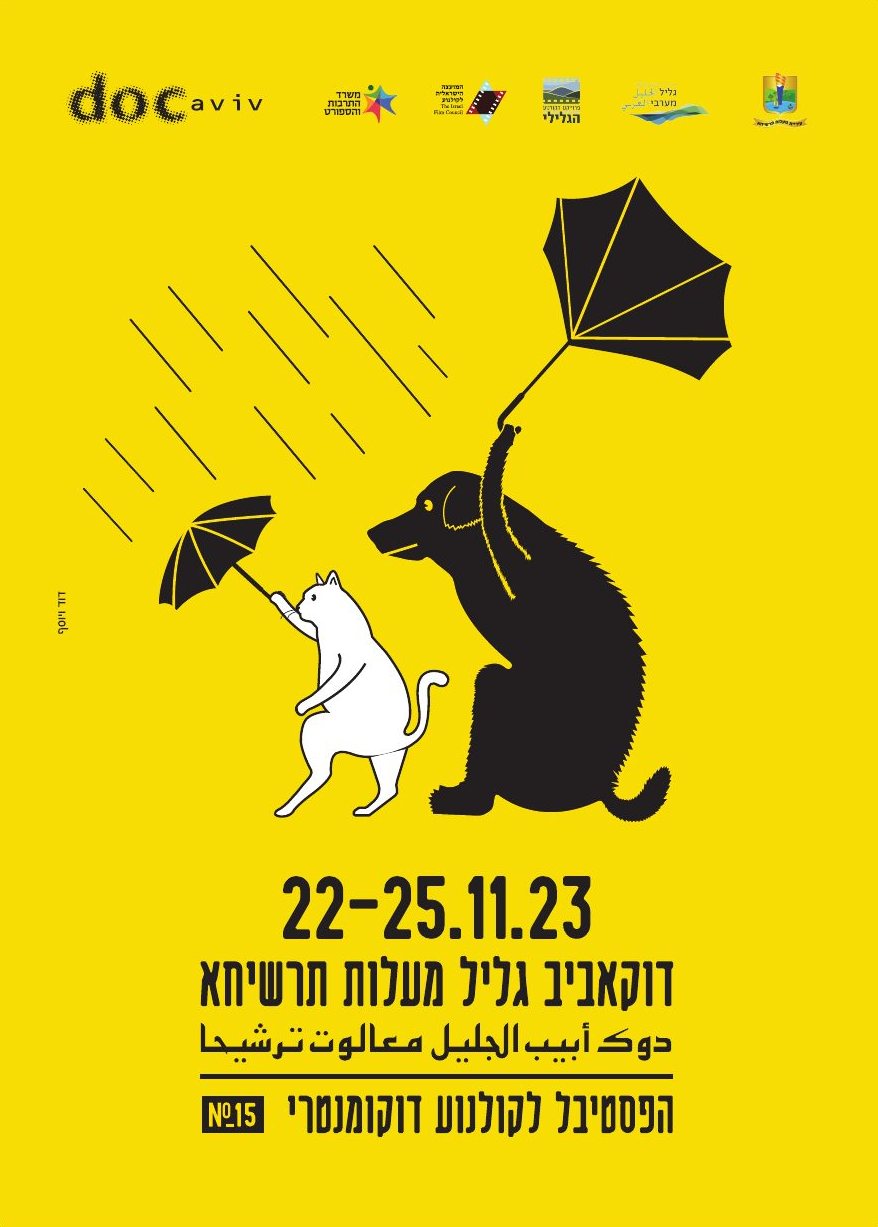
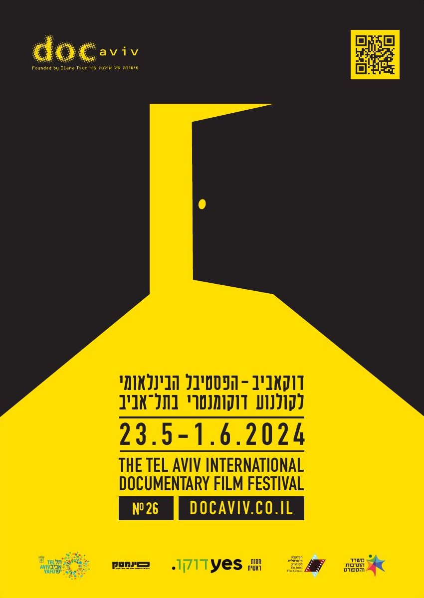
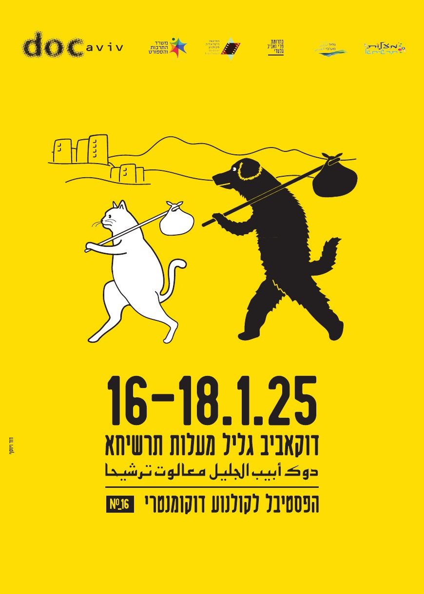
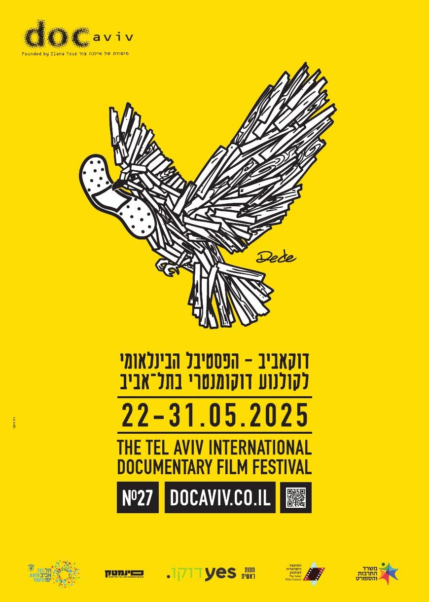
The 20th edition. Documentary walks a line between art and reality, so a figure walks the line in mid-step.
A year of repeated elections and deadlock. Armoured, slow, still moving forward.
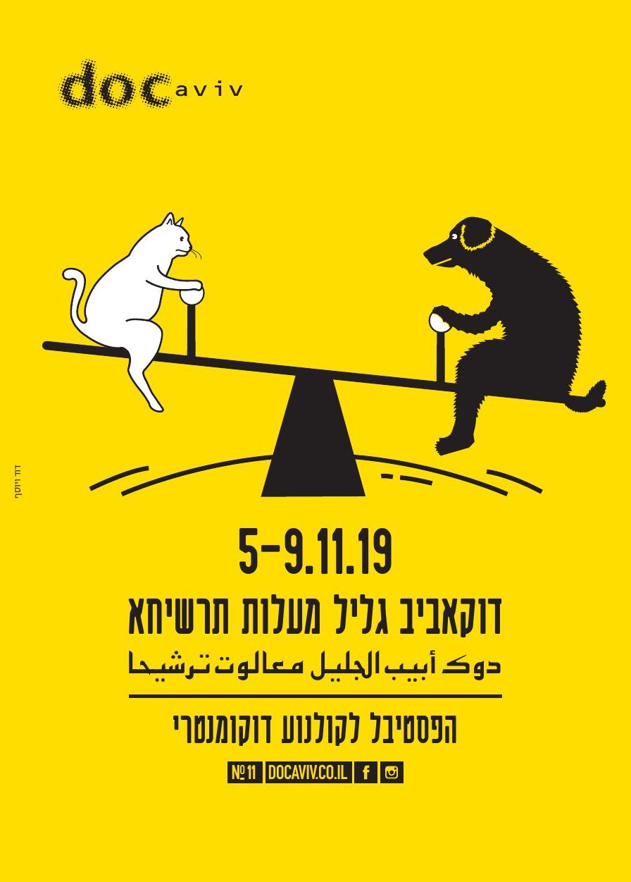
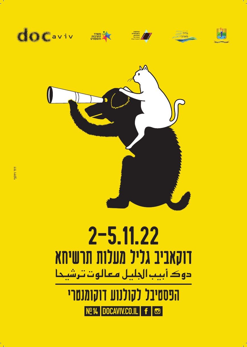
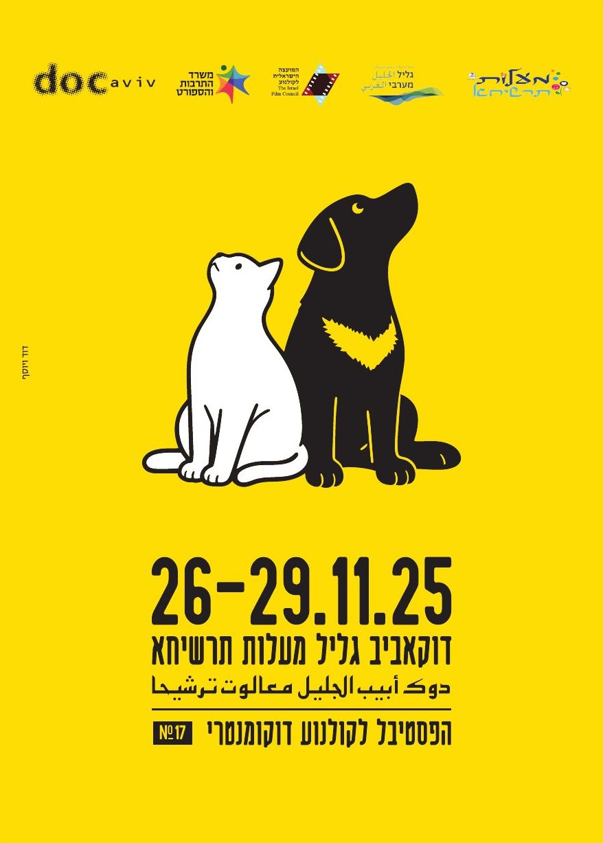
Ma’alot-Tarshiha is a shared Jewish and Arab town. A cat and a dog keep each other in balance.
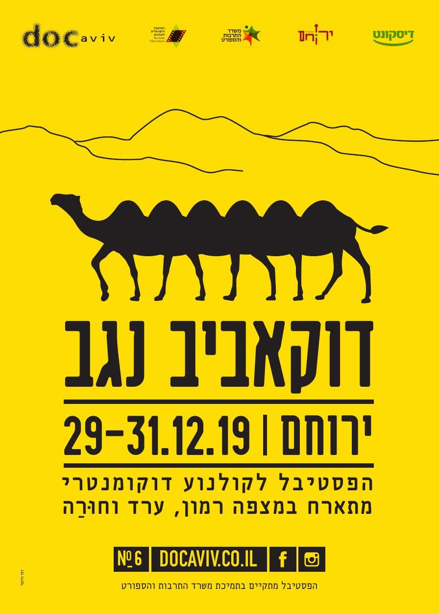
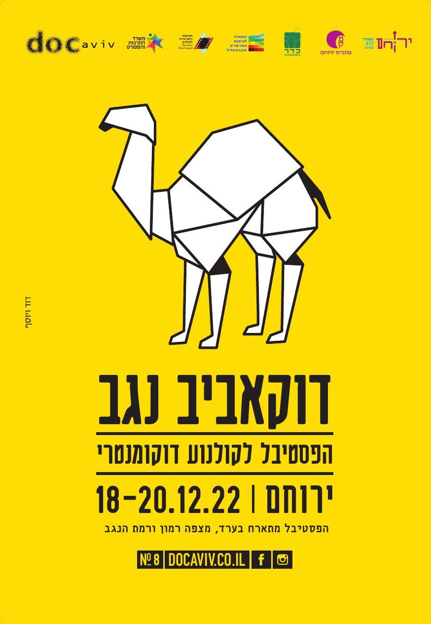
The desert’s own animal, stretched to carry every community of the Negev edition.
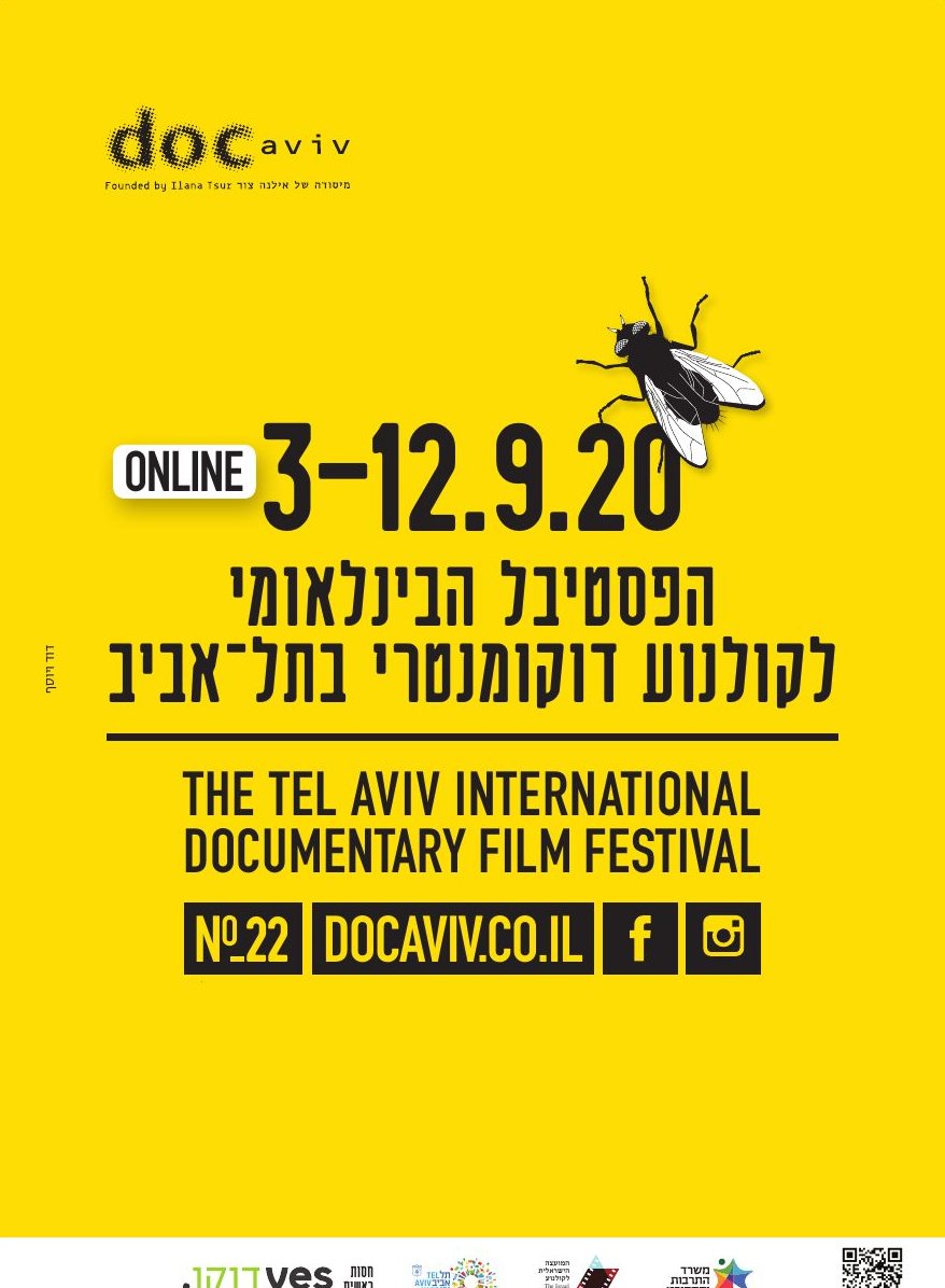
The pandemic moves the festival online. The classic documentary point of view, while everyone watched the world from inside.
Online again. Adapt to the moment and keep your colour.
The first summer after lockdowns, weeks after violence in the mixed cities. Black and white certainties melting in the heat.
The sea squill blooms at the end of the dry season and announces the first rain. A local sign of renewal.
A wide staircase narrowing to a slit of light. The long way up for the periphery.
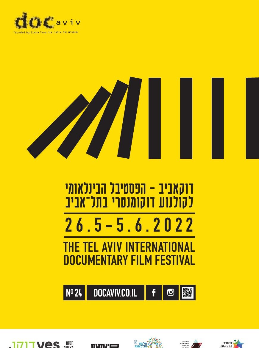
Weeks later the coalition fell and a fifth election in under four years was called. One push and everything follows.
Days after the election, the cat climbs on the dog’s back to see further.
The desert’s symbol folded from paper. Strong in outline, fragile in material.
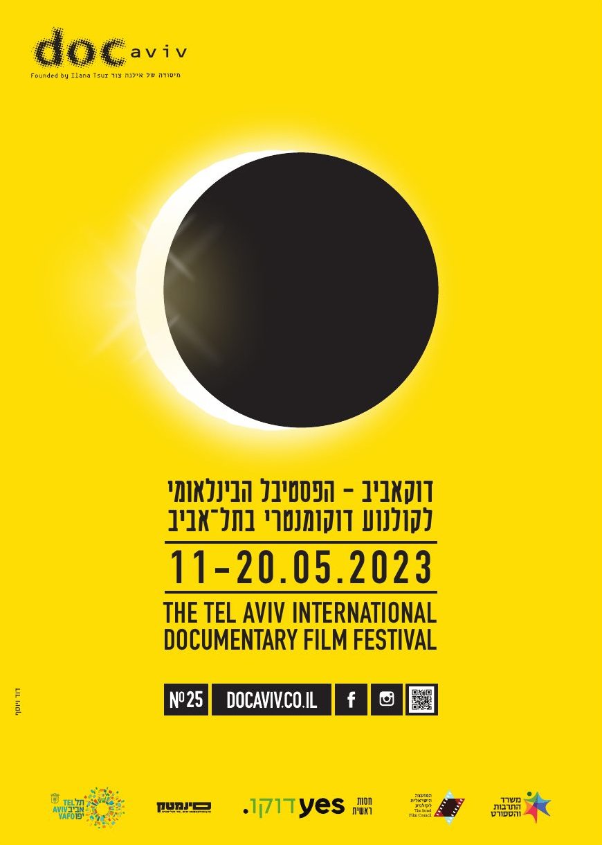
Months of mass protest over the judicial overhaul. Something passes in front of the light; the yellow survives around the edges.
After October 7 the north is evacuated and the edition runs online only. Lines fall from the sky; the cat holds its umbrella over both.
The war goes on and hostages are still held. For the only time the system inverts: black ground, one doorway of yellow light.
After more than a year under fire and a ceasefire, residents return. The cat and the dog walk home with their bundles.
A dove drawn in broken, splintered lines. Peace as something to be pieced back together.
No rain this time. The two friends sit side by side and look up.
For the edition in Ma’alot-Tarshiha, a shared Jewish and Arab town, we created a white cat and a black dog. Different, inseparable, and always facing the same situation together. Their story has followed the north: balance, the storm, the road home, and a quiet moment of looking up.
A festival identity that works like a long-running visual column. The system stays fixed, so every new image is read as a statement about the year it belongs to.
