An on-demand storage service
Website & mobile flow
Poof · Website case study
Poof keeps the things you love but don’t use every day, and brings them back when you ask. The site had to make storage feel light: no warehouses, no paperwork, just the thing you want to keep and the moment you get it back.
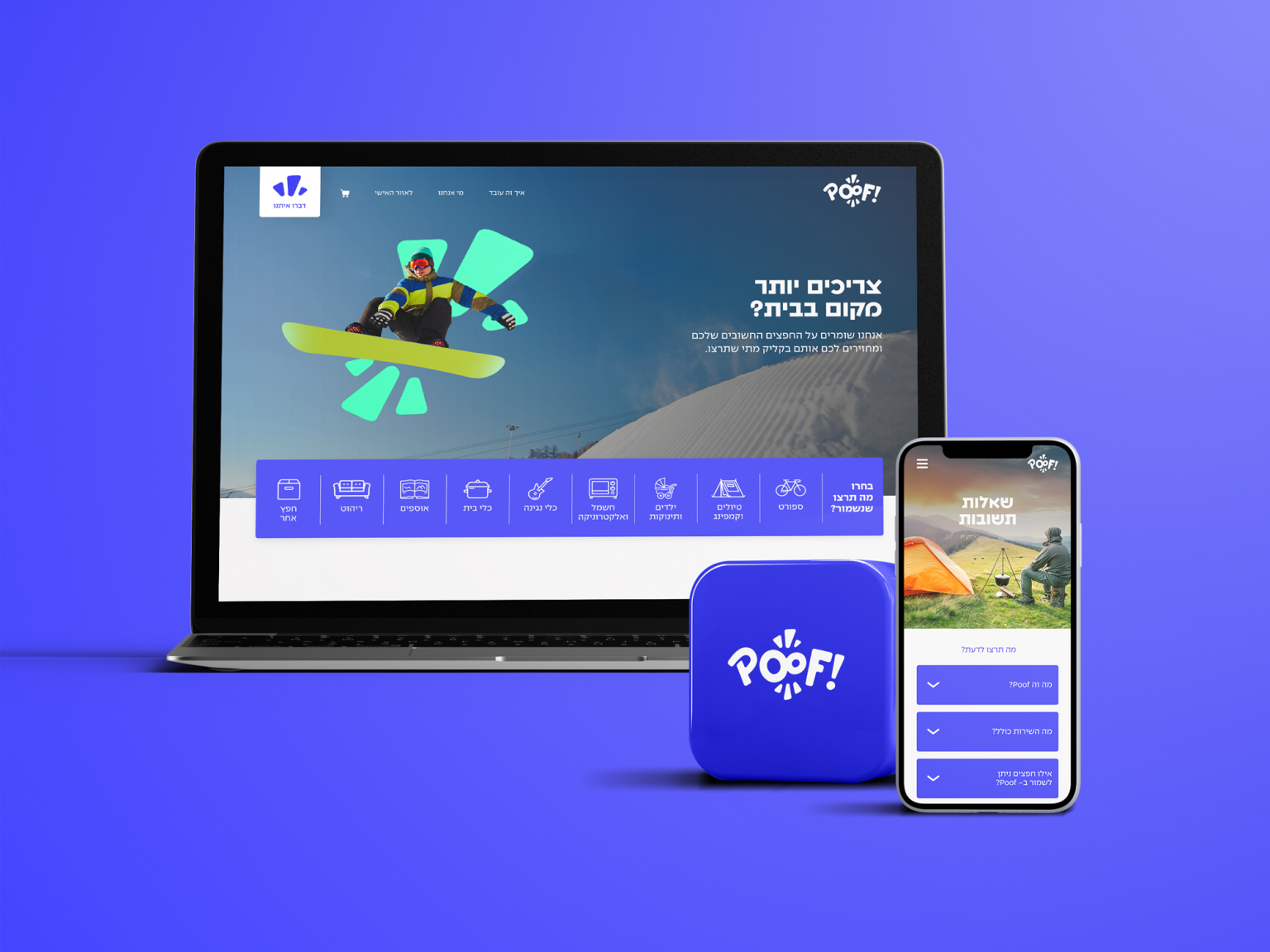
Start from the object, not the service. Bikes, camping gear, suitcases, a stroller: one tap on a category.
Choose a size and see the monthly total update on the spot. No quote form, no call back.
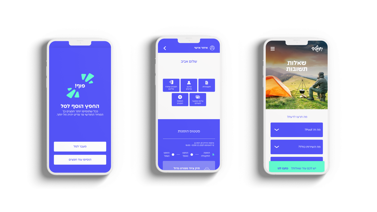
A personal area shows every stored item and its status, and orders it home in a click.
An electric blue carries the brand: the logo, the buttons, the whole flow on mobile. Around it the site is built from flat colour blocks, each section in its own bright ground, so a long page reads like a stack of boxes.
Blue is the only colour used for type and action. The block colours never carry text on their own.
The burst from the logo becomes the key visual. It sits behind every hero object and every person, in mint, coral or pink, like the moment something vanishes from your closet. Real people with their things, never boxes on shelves.
The shape frames a stroller, a guitar, a snowboard. The object stays the hero; the burst says it can disappear.
Photography shows the things in use: a trip, a song, a day out. Storage is the reason you get your space back, not the picture.
צריכים יותר מקום בבית? Need more room at home? The headline asks it, and the first button answers.
A full-screen slider of people and their things, a row of item cards, a short video on how it works, a pink block on why Poof, and a mint FAQ. Each block answers one question, in the order a first-time visitor asks them.
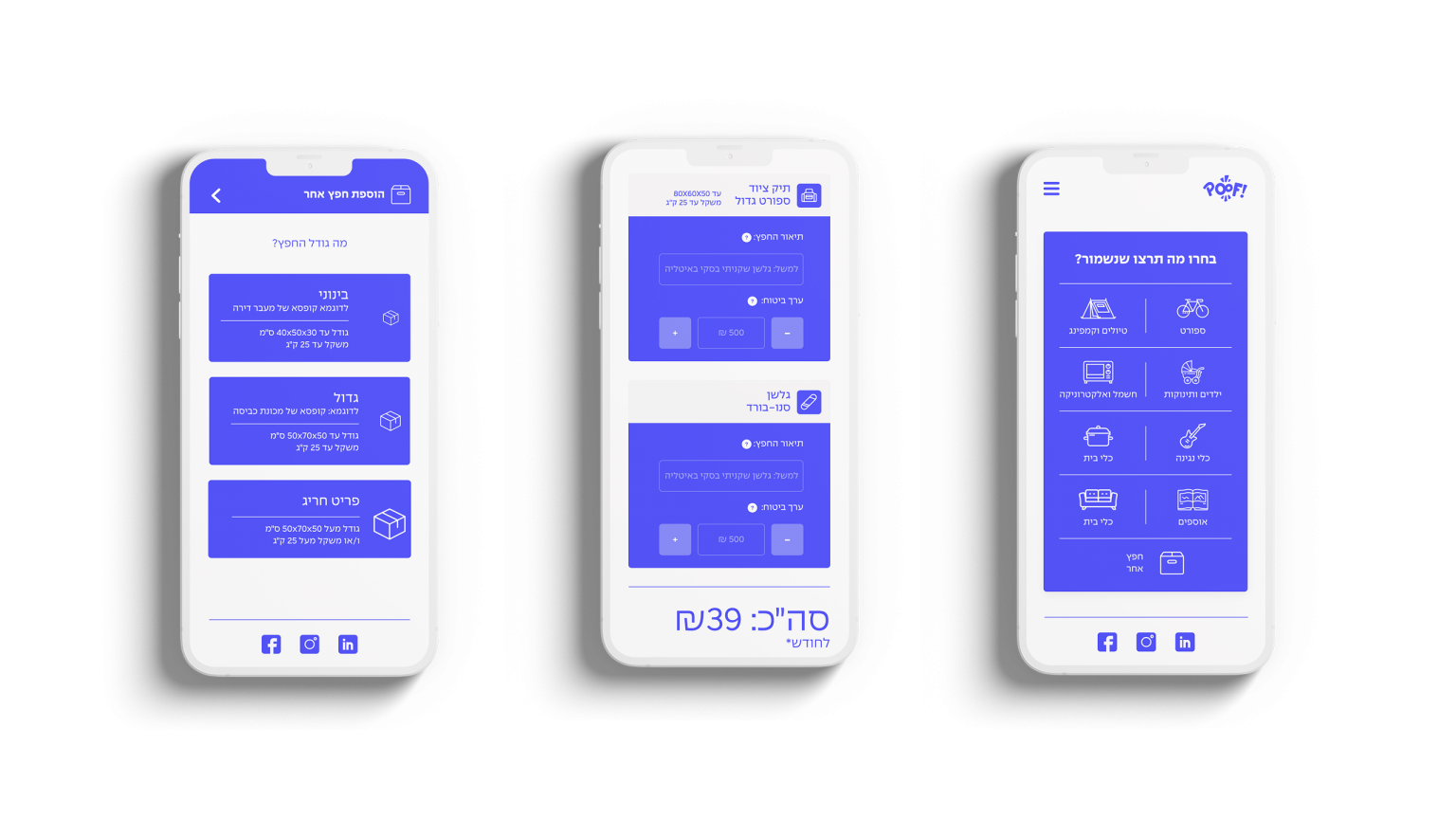
On mobile the whole flow turns blue. Pick a category from an icon grid, choose a size, from medium to an oversized item, see the price per month, add to cart. A personal area tracks every order.
A website for a storage service that never shows a storage room: just your things, your space back, and a blue button that brings them home.
